Keeping our talents in Ohio
Sep 17, 2014
Four years after Lebron James famously “took his talents to South Beach,” he decided to bring them back to Ohio. In his essay announcing his decision, he said “Our community, which has struggled so much, needs all the talent it can get.” In that respect, he’s right. Ohio’s share of the American population has steadily declined in the last few decades. As a result, Ohio has lost several seats in the House of Representatives. More worrisome is that a disproportionate amount of high-skilled college educated potential workers are leaving the state. Over 47 percent of people over 18 years old who left Ohio for another state in 2012 had at least some kind of college degree. Conversely, only 41 percent of new arrivals over the same time had a college degree. This net loss in education level is an additional burden for the Ohio economy since college educated workers are least likely to be unemployed.
Data from the Bureau of the Census’s American Community Survey (ACS) provides a detailed look at migration into and out of the state. The 2012 ACS generates estimates that help answer migration questions like who, where, and how many. Around 400,000 people migrated into or out of Ohio from/to another U.S. state in 2012. Estimates show the outward migration number to be larger than new arrivals to Ohio. The graph below illustrates an estimate of the percentage of Ohioans in each age group that moved between Ohio and another U.S. state in 2012.
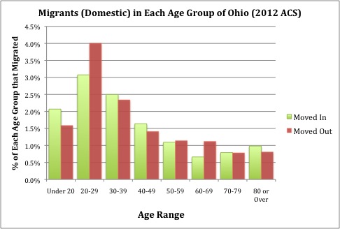
In 2012, approximately 4 percent of Ohioans in their twenties, moved to another U.S. state. It appears Ohio gains from inter-state migration during peak earning years (30-59) though. These families are likely bringing kids in tow, which drives up the rate of under 20’s migrants into the state. People moving to or from a foreign country are not included in this analysis.
The map below illustrates the destination or origination of the migrating population. Shades of red indicate a net loss of population for Ohio and green indicates a net gain.
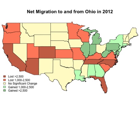
Overall, this fits with the national narrative of Midwest states gradually losing population to the South and West. However, in 2012 at least, Ohio stemmed that loss by attracting population from many surrounding states and even the northeast.
Total volume of migration in either direction between Ohio and each state is not visible in the map. Adjacent, and other high population states around the country are predictably the ones to top the list of states that share the most migrants with Ohio. Below is the top 20.
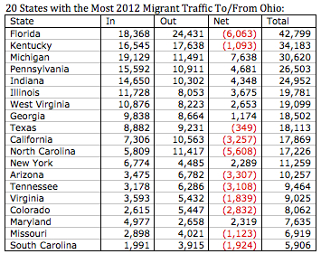
The numbers are estimates using ACS weighting procedures and each should be given a margin for error, but a few points previously hidden in the map are important.
- Florida is not just a one-way drag on Ohio’s population. According to these estimates, Florida provided the second most domestic immigrants to Ohio, behind only Michigan.
- Despite being a net drain on Ohio’s population, Kentucky also provided a large number of migrants to Ohio.
- Although there was no significant net change in migrants between Ohio and Texas, it still represented one of the largest volumes of traffic between states.
A key component of migration is education level. Ohio (or any other state) wants to keep and attract, the best and the brightest. Below is a look at domestic migrants by education level, with all Ohioans included as a benchmark. For the education analysis, each group is restricted to adults, over 18 years of age.
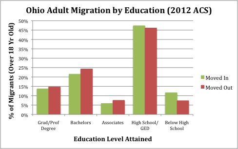
Each color displays the educational distribution of that entire group. All states as a whole will be less educated than their migrants. Education is one of the leading factors of greater mobility. Unfortunately though, the education level of the people leaving Ohio appears to be greater than the group moving in. Using the same data, it’s estimated that about 64,000 people with a Bachelor’s degree or higher moved out of the state during 2012, while only around 52,000 moved in.
Combining the age and education of migrants to look at the peak earners, where Ohio had a net gain, doesn’t change the story. The pie charts below show the distribution of education among migrants aged 30-59. This is a population which has most likely completed their entire undergraduate and graduate level of education.
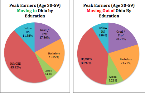
Over 56 percent of peak earners moving into Ohio in 2012 had no college degree of any kind, compared to less than 49 percent of those moving out. Each of these numbers are estimates with margins of error as well, but the edge at each education level for those moving out over those moving in paints a clear picture.
Ohio has college enrollment rates that usually match or exceed the national average. It needs to do a better job creating an environment in which those graduates want to stay after their education is done. Identification of “population rival” states such as Florida and others that top the list of Ohio migrant traffic volume, could be a starting point for policymakers to target the right strategies for attracting and keeping talent in Ohio. Ohio policymakers need to continue to create policies that create job opportunities for individuals and small businesses.